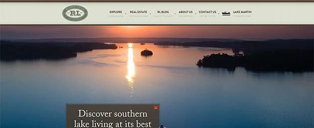
We all know technology is racing ahead faster than most of us can keep up. Nowhere is that more true than on the Internet, where changes in style, methods and even the devices by which we access it seem to change from one week to the next. Russell Lands On Lake Martin knew it was time to make our main website mobile friendly, and also to refresh the look and feel. And Explorer got a facelift in the process.
It is projected that by next year more people will access the Internet from a handheld device than on desktop or laptop computers. That seemed inconceivable only a few years ago. The new website is built as a responsive site, meaning that one single site adapts to the screen size of the device being used, whether desktop, tablet or smartphone.
Better to see you with, my dear
The other goals in redesigning the website were to freshen its aesthetic and let quality photography take the lead role. "People won't read as much copy on screen as they do in print," said Jeff LaMonica, Russell Lands' web developer. "And no amount of cleverly written text can tell the story of this beautiful place better than seeing the images."
The result is a website with a fresh look and feel, much more emphasis on beautiful images of the place, yet retains all of the information about our companies, neighborhoods, events and the search tools to help people find their own slice of heaven in the best neighborhoods on Lake Martin.
We hope you enjoy it, and find it useful. You might even show others this idyllic place in which we live.
Visit the website >
Let us know what you think >



 05.2013